A life in shades of gray is pretty dull, isn’t it? What gives us energy and makes us feel a whirlwind of emotion are colors. Each hue, combination, and application can generate a positive (or negative) effect depending on its use.
And this is not limited solely to the visual arts. In clothes, furniture, commercial products, and especially inside the home, colors have a great influence on the way we live.
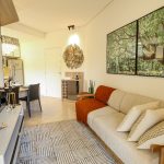
When we think of decoration, we immediately think of the color palette, a kind of ruler used to identify the dyes that match perfectly and create the expected magic in the air. A well thought-out decoration takes colors very seriously, and every good interior designer knows this.
In today’s post, to give you a hand, we will present some powerful tricks that can only be done with the wise use of colors. If you want to establish a modern, sophisticated, and beautiful decoration, according to your personal taste, read on!
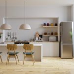
The most used colors in home decoration
The influence of white on the environment
White is a color that goes well in many situations. Its application is almost a joker and has become timeless, present in many concepts and types of decoration. By applying it, it is possible to create unusual contrasts and highlight details in a different way.
But remember, bet on variants too, such as beige and light gray so as not to make the place too monotonous.
White represents faith, serenity, peace, knowledge, and intelligence. It also transmits sobriety and maturity, since it is considered a neutral and “non-dispersive” tone.
The influence of Black in environments
Popularly, black is not considered positive, something that causes fear and apprehension during decorating. However, its strong and impactful qualities make it a great option if used well.
Like white, it is a neutral shade that is easy to fit into space, since it blends with virtually every other color and style. When done well, the first impression will be one of sophistication, stateliness, elegance, and authority.
The influence of red in the environment
Who doesn’t like red? Besides being closely linked to sentimentality, especially love, inside the home it awakens receptivity and confidence.
Due to its vivacity and unique brightness, a good idea is to use the color to highlight objects or harmonize in small portions with other colors. The existing fear about using it is plausible, one must use it with care and responsibility, and avoid exaggeration.
The influence of yellow in environments
Just like red, yellow is great for making small combinations. The various shades that the color has attribute energy, joy, and brightness to the decoration. When interacting with it, several creativity and positivity stimuli emerge, it generates more concentration, tranquility, and optimism.
Children’s rooms are ideal for testing the color because it stimulates and makes the place more receptive. Offices are also great options to receive yellowish shades.
The influence of green on the environment
The use of green has grown at the same speed in which themes such as sustainability, nature, and the environment have gained prominence. However, its peculiarity makes it difficult to find decorative objects and furniture in this tone, making many resort to the green of flowers and plants.
This shade has calming power, capable of relieving the stress of everyday life. It is also capable of stimulating pleasure and creativity, depending on the intensity of the color. It is associated with health, fertility, vitality, and tranquility.
The influence of Blue in environments
If you want to transmit peace, calmness, security, and confidence, blue is the right choice. In any scenario, it transmits freshness and lightness, stimulates productivity, and collaborates very well with several other “cool” colors.
This color also has a strong connection with nature, especially the seas and the sky. During winter and winter, it makes the rooms of the house extremely cozy and welcoming.
The Influence of Orange in Surroundings
What do you think of orange? Too gaudy? Too gaudy? Maybe, but you should know that its use can be very worthwhile when well harmonized with other factors in your decoration, just be careful and apply it wisely.
This is a powerful option for items and walls, and betting on the other shades of its spectrum is a very smart move. Because it is reminiscent of summer and warmth, it is a tone that can easily light up the atmosphere and lift the mood.
Its use stimulates enthusiasm and positivity. It is recurrently associated with health, joy, animosity, pleasure, and friendship. It is as exciting and stimulating as red and yellow.
Room decoration: Bet on color variation
Never stick to just one shade of color. Keep in mind that there are several shades (also known as “shades”) that can be explored and applied in countless ways.
Several times, the option you want to use is not the perfect one for that occasion, so decreasing or increasing the intensity of it can be a resource that will yield very positive results.
With these tips it will be easy to carry out a renovation or just change some items in your house until you get a totally new and much nicer look.
Would you like more decoration tips for your home? Then visit the VRV blog for more posts like this one!